OR Day 19: Understanding Page Builders Block Editor Part 2: Blocks
Adding Blocks
You can add blocks by clicking on the “+” sign in the top lefthand corner or typing a “/” on the page and the most frequently used blocks will show up for you to click on.
Headings
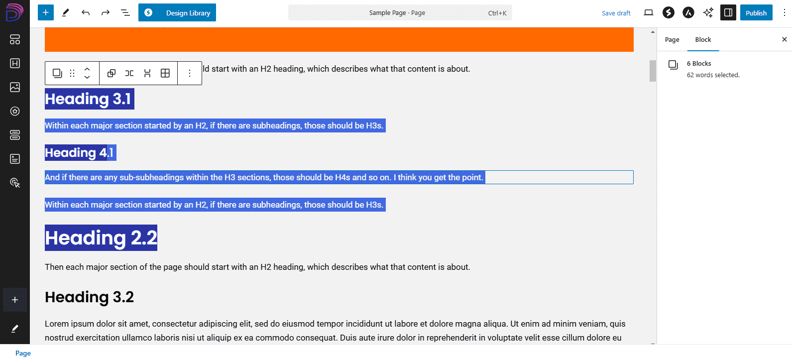
An important note about headings. It matters that you used them in descending order, according to hierarchy of the information. You should use them as follows.
- Heading 1
- For Headings, to be search-engine friendly and for proper SEO, you should only have 1 H1 heading per page, and that should be the page title.
- Heading 2
- Then each major section of the page should start with an H2 heading, which describes what that content is about.
- Heading 3
- Within each major section started by an H2, if there are subheadings, those should be H3s.
- Heading 4
- And if there are any sub-subheadings within the H3 sections, those should be H4s and so on. I think you get the point.
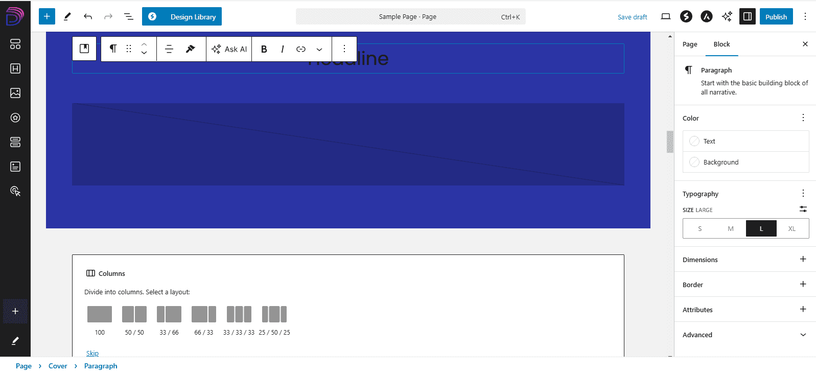
Heading Settings
When you click on any block, you’ll see a menu of options appear above or below it, and for headings, there are settings there for alignment, bold, italics, links, and under the arrow, more like colors.
You also click on the six dots and then drag to move any block or use the up and down arrows to move them above or below nearby blocks.
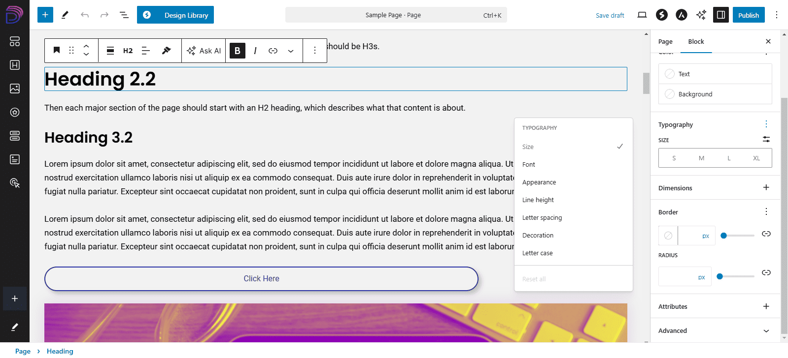
In the righthand panel, there are more and for every section of settings, like “Typography,” you’ll often see either three vertical dots or a plus sign. When you click on those, there are more settings you to enable or use.
So for Typography, you can enable font, appearance, line height, and so on, and then those options will appear in the panel as well for you to use.
Button Settings
For buttons, there are settings for alignment, links, colors in hover menu, and options to change style, color and typography, dimensions or spacing, and border and shadow on the side.
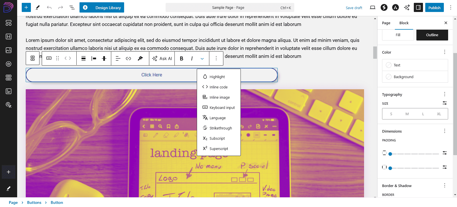
Image Settings
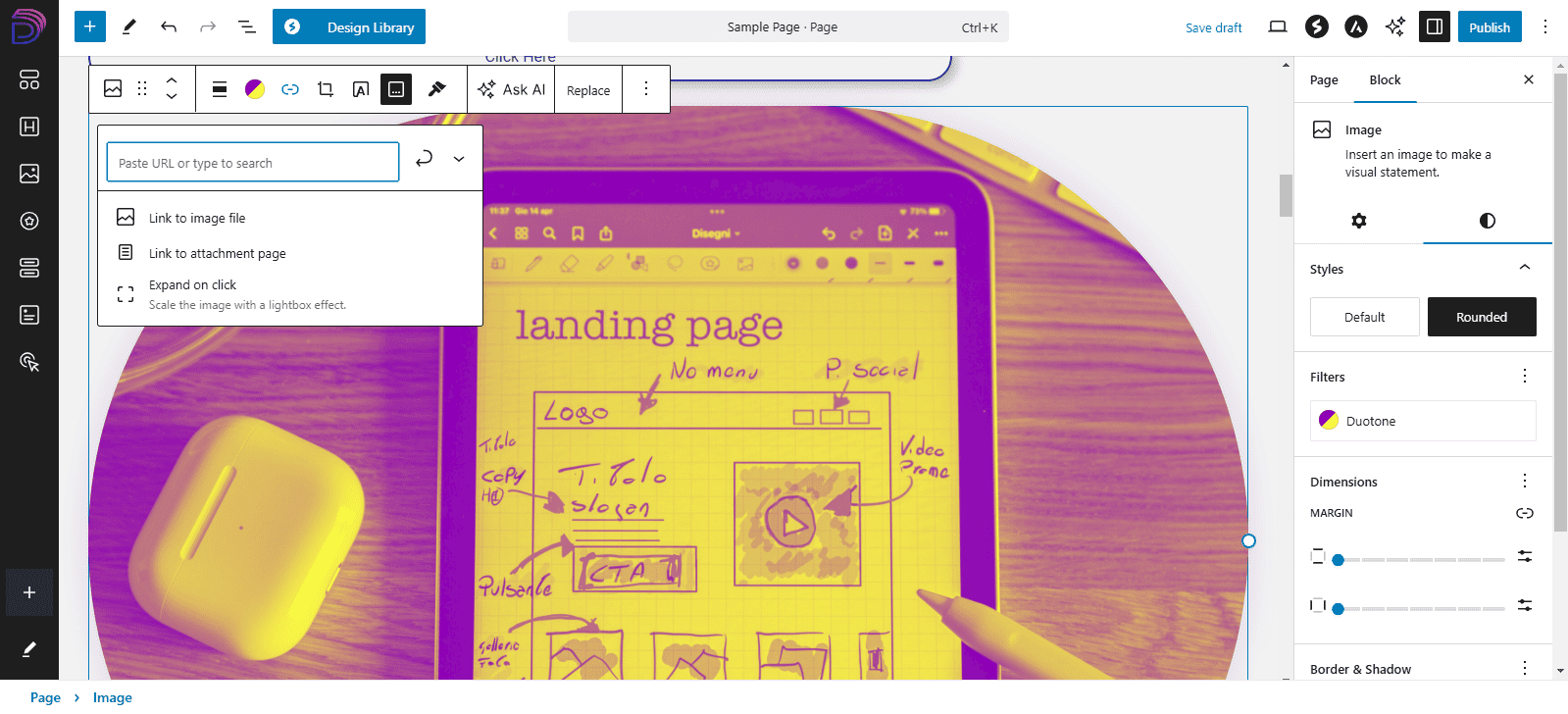
For image, there are options for color filters, adding a link, expanding the image when a user clicks on it, captions, changing the standard size, and on the right, there are more about the shape among the other typical settings.
Cover, Columns and Grids
There are some blocks that you might want to use to contain the other blocks, like cover which you can use to create a unique background on top of which the heading, text, and button sit.
You can also create columns using the limited layouts given, and you can create a grid to organize multiple text boxes or images in a more fixed layout.
Group, Row or Stack Blocks
When you select multiple blocks at the same time, the hover menu will give you the options to group them together as one unit; put each block in its own row, side by side; or stack them vertically in a column.
You can also turn each block into its own isolated element within a grid.
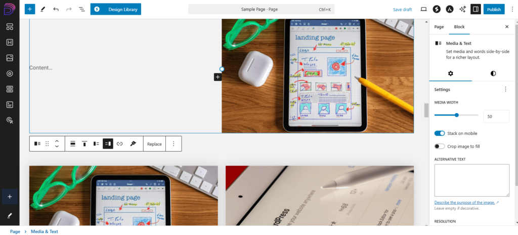
Media & Text and Gallery
For Media & Text block, you can find settings to put the image on either side, and on the righthand panel, you can adjust the width of the image or video. You can also adjust for mobile.
For Gallery, you can add multiple pictures, and each one can be styled with nearly all the same settings as for the image block.