
Days 11 – 12: Customizing Sitewide Settings
You can take 2 days to decide on your colors and fonts, but if you already have your branding figured out or it won’t take you long to choose, you can complete this step in minutes. Remember that if you’re unsure, you can always change the fonts and colors later.
Go to Appearance > Customize to edit the sitewide settings for your WordPress site.
For Astra, just about all of the theme settings are here, and you can also get to them by going to Astra > Dashboard in the backend.
The WordPress customizer, especially with the Astra theme, makes managing your website much, much easier. Rather than having to change the accent color of your buttons one by one, for example, you can change them all at one time in the customizer.
Global
Typography & Color
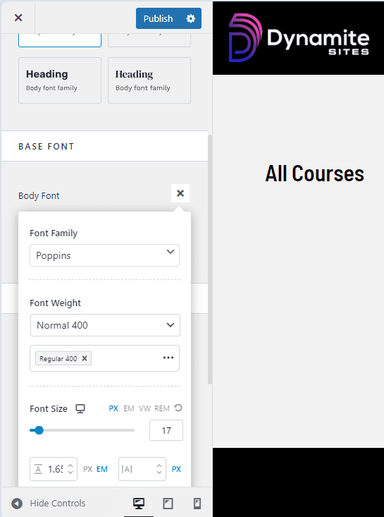
Under Global > Typography, you can choose the pair of fonts for headings and text that you like the most. You can also change the default size, weight, or style for the fonts by clicking on the pencil icons under Base Font and Heading Font.
To explore the free fonts, Google fonts, and see what they look like in an easier way, you can check out Google’s font website. Even if you can’t find exactly the font you’re looking for, I bet you can find one that’s similar and still free and available in the customizer.
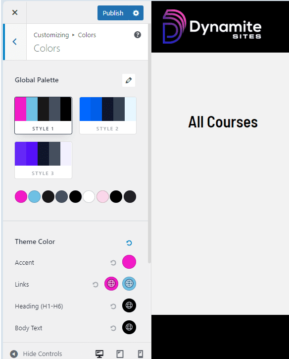
Under Global > Color, you can click on the pencil icon in the top righthand to change the current palette to a different set of colors. Once you decide on a palette, you can further customize it by changing each color individually by clicking on the colored circles.
Most importantly under Color, you can decide the accent color, typically a bold color for your call-to-action buttons (CTAs) and links, so that your user doesn’t miss them and knows exactly where to go to buy, subscribe or donate.
You can decide the color of your links. There are two circles there because the first color is for Normal, when they’re not clicked, and the second is for Hover, when the mouse is on them.
You can also decide the color of headings or titles, body or paragraph text, and down below, the background of your entire site.
For the most part, your colors should be uniform across your whole site, so your accent colors for buttons and links should be the same.
Style Guide
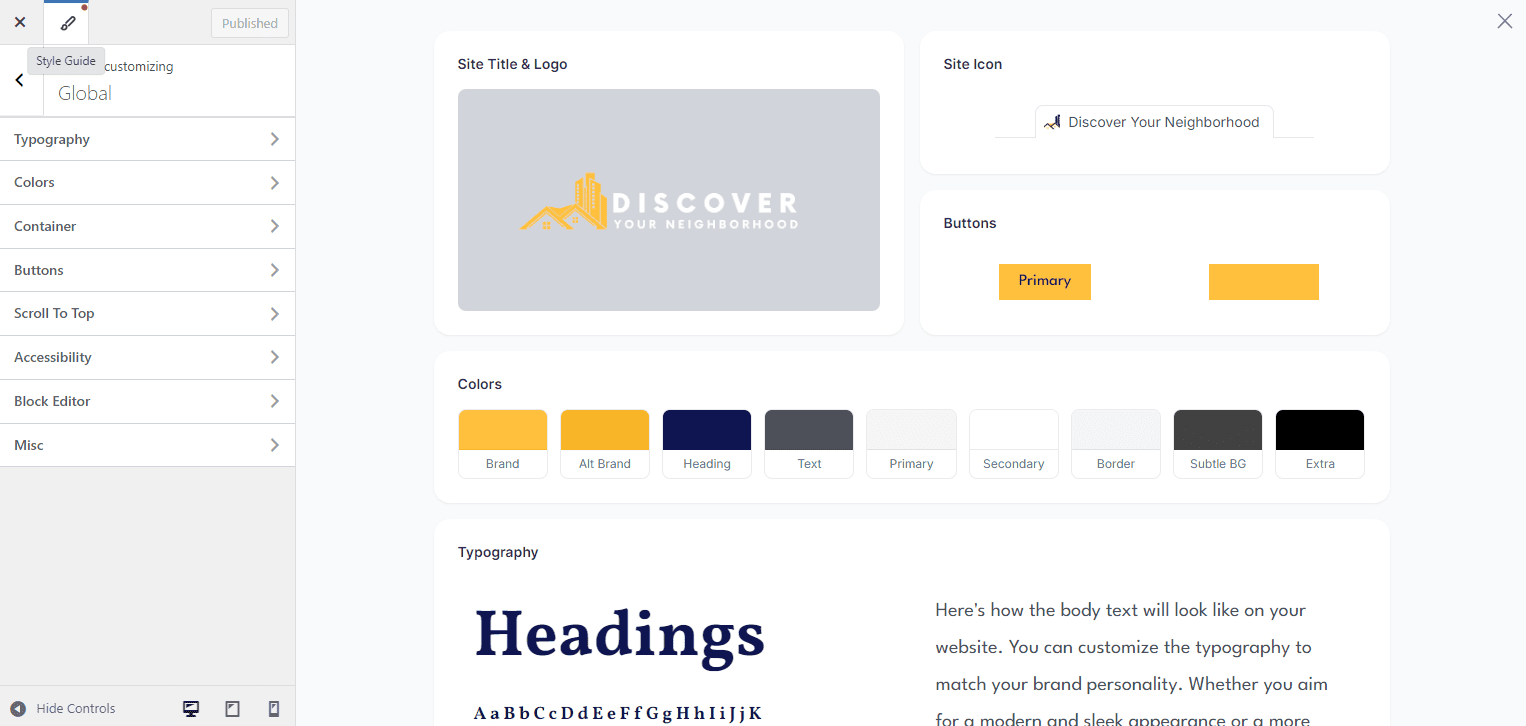
IMPORTANT: Astra has added a Style Guide area to help with understanding, setting, and previewing all your branding for your website.
Just click on the pencil located in the top left corner next to the “X” for exiting the customizer, and you’ll see a further explanation of what each of the 9 colors of the palette are for, plus how your font looks like in headings, body text, and more.
The first color is the accent color, and the second is the secondary accent color, which you can use as a hover color for buttons and links, for example. The next two are colors for text, headings and body paragraphs. The next two have to do with colors of links and container backgrounds, and the next one is for the color of borders.
Scroll to Top Button
Make sure that under Global > Scroll to Top, the option is enabled so that users can click on the arrow in the bottom righthand corner of the website to go to the top of the page.
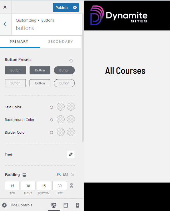
Optional Customization: Container & Buttons
IMPORTANT: You very likely DON’T need to customize these at all because if you like the template you’ve installed, then just stick with the current spacing of the content and the default colors for the button is set in Global > Colors > Links. This section is just for your information.
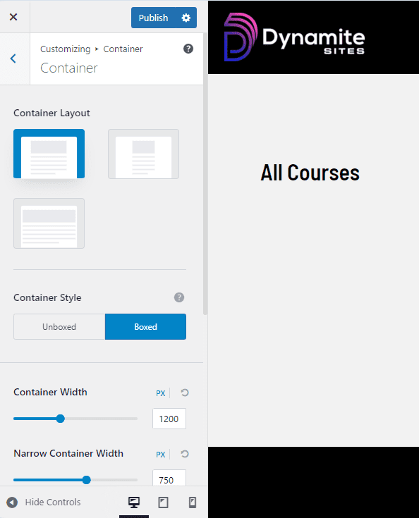
Under Global > Container, you can decide whether your content is normal or boxed, kept in a narrow section in the middle of the page, or full width. The first one, the boxed layout, is standard.
Under Global > Buttons, if you don’t want your buttons to use the accent color or you want to give them a different font, different shape, or border color, you can make those changes here.
The rest of the Global settings can remain as they are.