
Day 31: Responsive Testing
Latest Version of Your Website
First off, before you do any testing of your website, make sure that you’re seeing the latest version with all the recent updates by doing these two things.
Disabled CDN
Make sure that the CDN is still disabled until you’re mostly done building the site.
Flush Cache
Flush the cache, and I’ll explain what this means.
When you go to a website for the first time, your browser stores files of the site, so when you visit again, it doesn’t have to download everything each time, which would mean longer loading times.
However, as a result of serving you the stored files, the browser may not be showing you the latest version of your website.
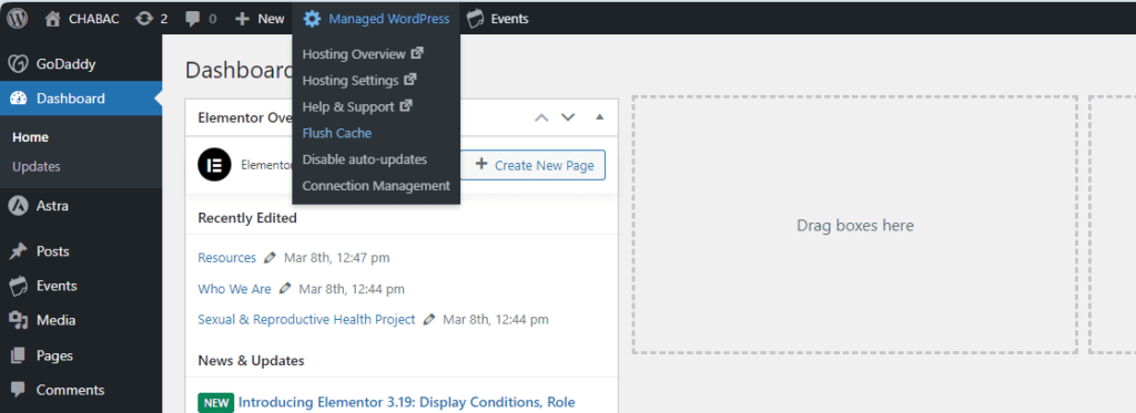
So, go to your Dashboard > Managed WordPress in the admin toolbar above, and you’ll see a menu with some settings from your hosting account.
Click “Flush Cache.” That will erase the old, stored files of your website, and then your browser will have to download the latest, fresh files of your website with all the changes you’ve recently made.
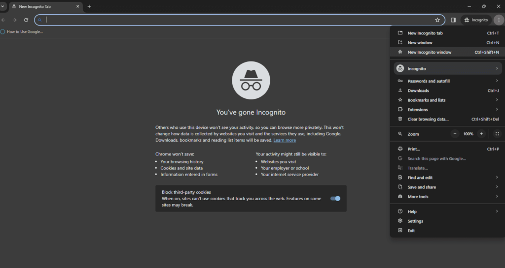
Chrome’s Incognito Tab
Chrome’s incognito browser is incredibly useful for web designers. In the incognito mode, the browser shouldn’t store any information about your previous visits, so that means that each time you visit a website, even the same website, it’s as if you’re a first-time visitor.
You can explore your website as it’s currently being seen by new users, and therefore, it’s best to do website testing in incognito mode.
Devices
Throughout the creation of your website, you should be using the customizer’s, Elementor’s or the block editor’s responsive editing modes to check how your website looks on tablet and mobile.
The responsive views within WordPress aren’t always 100% accurate, so it’s best to check on actual devices, your own or your friend’s if you don’t have devices of all sizes.
Even then though, it’s impossible to check what your site would look across different models of phones and tablets.
With a basic site, you’re very unlikely to have a problem where your website shows up differently on an iPhone than on a Samsung.
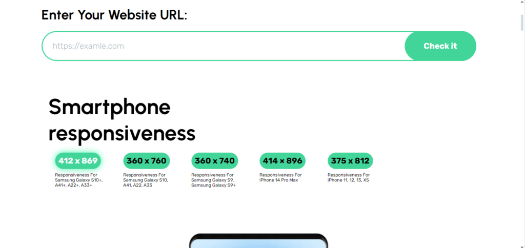
But nonetheless, here’s a free tool where you can see how your site looks on different builds, models, and such: websiteresponsivetest.com.
Browsers
Responsive testing also includes making sure your website performs properly across different browsers.
So make sure to check out various pages on your site in Brave, Firefox, Edge, Safari and so on, and that you’re not logged into those browsers when you’re testing.