
Day: 27: Designing Beautiful Pages
If you want to create pages from scratch, there are some things you should keep in mind to make them attractive.
By beautiful, I don’t mean using the prettiest images or fonts. I mean following some of the basic principles of design, explained below.
Negative Space Or White Space
Which one looks better, the page where the text is spread out or where it’s boxed in the middle of the page?
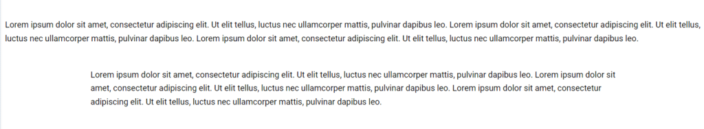
Hopefully, you’ve answered the second one, and the reason is negative space.
Filling up the entire width of the page can create a daunting experience for the user as their eyes become overwhelmed with so much content to look at.
So spacing is very important. Keep the container on the default option of Boxed instead of Full Width in Container > Layout > Content Width to achieve this. It’s not just about spacing at both edges of the page, but also between different sections.
You can increase the top and bottom paddings or margins of the section by going to Container > Advanced > Padding or Margins for this kind of spacing. You can also increase the height of the container by going to Container > Layout > Min Height.
And to make sure the content is centered within the container, not right at the top, go to Container > Layout > Justify Content > Center.
Remember to give the user a chance to breath.
Variation
Which is easier to read, this page with alternating background colors or one with only a white background?
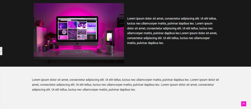
I bet your answer is the first one, and you’d be right.
You don’t want to create pages that seem endless without any disruption using colors and images because it can make the content seem boring and lacking in vibrancy or dynamism.
To change the background of a container, including adding a background image, go to Container > Style > Background and for an element or widget, go to Advanced > Background.
Emphasis
Which button stands out more?
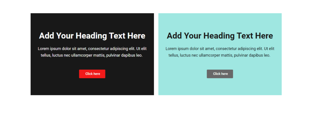
The first one, obviously, because the bold button color that contrasts with the background makes the button pop out.
Notice that the second most important part of the section, the heading is emphasized by its large font size, and the description, the least important, is smaller.
Symmetry
Which pair of columns looks neater, the blue ones or the yellow ones?
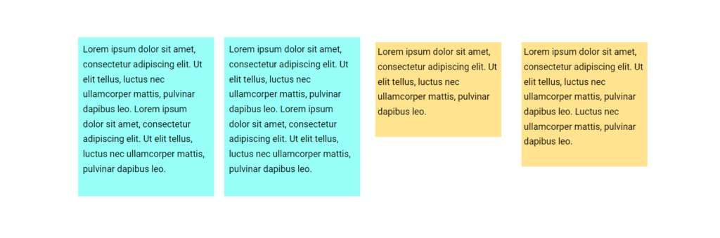
The second one because the borders of the columns are the same height.
Now, asymmetry can work too, and it can help with emphasizing the important elements of the page, like the price box for the more important product being bigger.
But asymmetry that’s accidental and unintentional can look terrible.
Consistency
What’s wrong here?
Well, the fonts are different sizes. Little missteps like that can make a website seem very unprofessional because the lack of attention to detail can suggest to the visitor that you don’t care.
Another example is using all kinds of colors that are off-brand instead of sticking to your palette.
Balance
Pages with too much text look like an intimidating wall of words.
You might be writing a long blog article and so understandably, having lots of paragraphs is unavoidable.
But make sure to add headings and subheadings; have enough spacing between the lines and that the font is very readable; and insert the occasional picture to break up the monotony.
I’ve also seen webpages with too many pictures.
Having a lot of images with few words does not provide enough context or useful information to the visitor.
You need to strike a healthy balance between images and text, also because Google ranks pages higher if they include related optimized images and helpful content.
Dynamism
Light or No Animation
It can be very tempting to add a lot of bells and whistles to a website, like tons of animation to make text and images go flying or plugins to add fancy sliders, image carousels, and all types of scrolling.
But having too many decorative features means having too much extra code that slows down page-loading times.
You don’t want to sacrifice performance for beauty.
Sometimes, websites that are too busy with animation don’t provide the best user experience anyways since it can be distracting from the main message.
Instead, make your site dynamic in more subtle ways by adding unique graphics, icons, and gradients and shadows.
Gradients & Shadows
Both of these decorative styles can give elements a three-dimensional look that suggest movement, making the appearance of the whole page more exciting.

To add shadow to an image, go to Image > Style > Box Shadow, but for other elements, it might be under Advanced > Border > Box Shadow.
Tips & Tools
Study highly professional websites you like to figure out how they achieve the right balance, variation, emphasis and so on.
Also, if you pay for Elementor’s AI, it can create layouts based on any website that you like.
It won’t recreate the content because that would be a copyright violation, but it sets up the containers and widgets in a very similar way.
