
Day 14: Customizing the Footer
There can be 3 footers on your website. As you can see in my example, I just have one.
- Above Footer, where you can put social links, one of your menus, or even a CTA or subscribe to newsletter widget
- Primary Footer, where you put your logo, contact info, and primary menu links
- Below Footer, where you put the copyright and links to your policies (privacy, terms & conditions, and cookies)
Hover over the section of each footer, and you’ll see a “+” sign appear. Click on it to add a widget, a section with content or functions.
If you click on the gear icon next to each header, you can change the background color, borders, and the padding (space around the element) or margins (space between elements) to style it further.
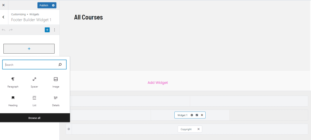
Widgets
Widgets are sections that, in the Astra theme, you can add to your header, footer, and sidebar.
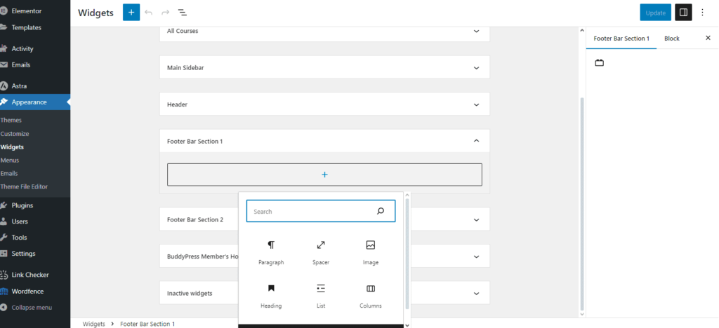
Stay in the Header or Footer Builders or go to Appearance > Customize to add content or functions, especially to the footer columns.
Notice the widgets use the block editor or Gutenberg, the default editor that comes with WordPress, so you have to become familiar with how it works. We’ll talk more about the editors or page builders in the next module.
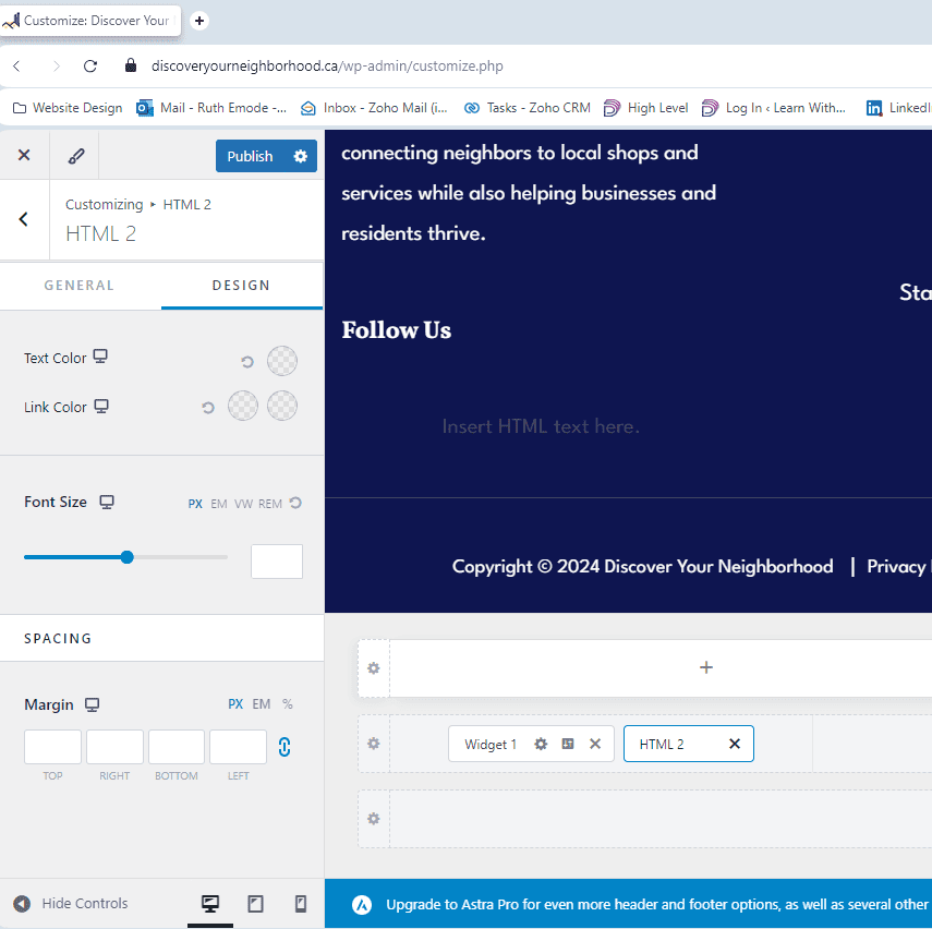
Customizing the Footer Widgets and HTML Sections
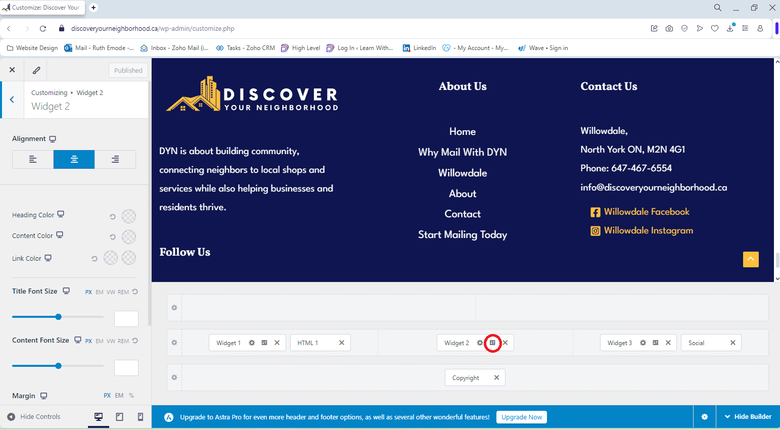
It can be difficult to find the settings to customize the footer sections, so here are all the different locations.
For the widgets, the gear icon takes you to content side where you add content, and the design icon, circled red, takes you to the styling settings.
The widgets use the block editor for adding content, and the block editor has a couple of hard-to-find places for extra settings.
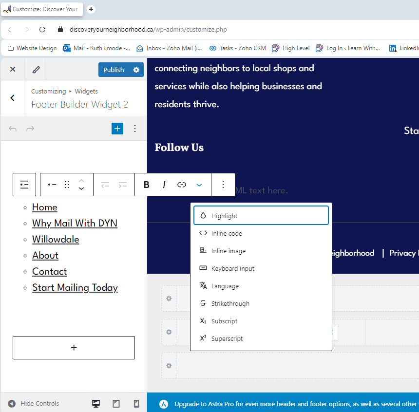
When you add a paragraph, heading, list and most other blocks in a widget, you’ll see the horizontal bar come up with some options, like Bold or Italics.
Next to link icon, click on the downward arrow and you’ll see more options, like Highlight which is for background colors or Inline Image to add a picture in line with the text.
Then if you click on the three vertical dots to the right of the downward arrow, you can click on Show More Settings to open up even more options.
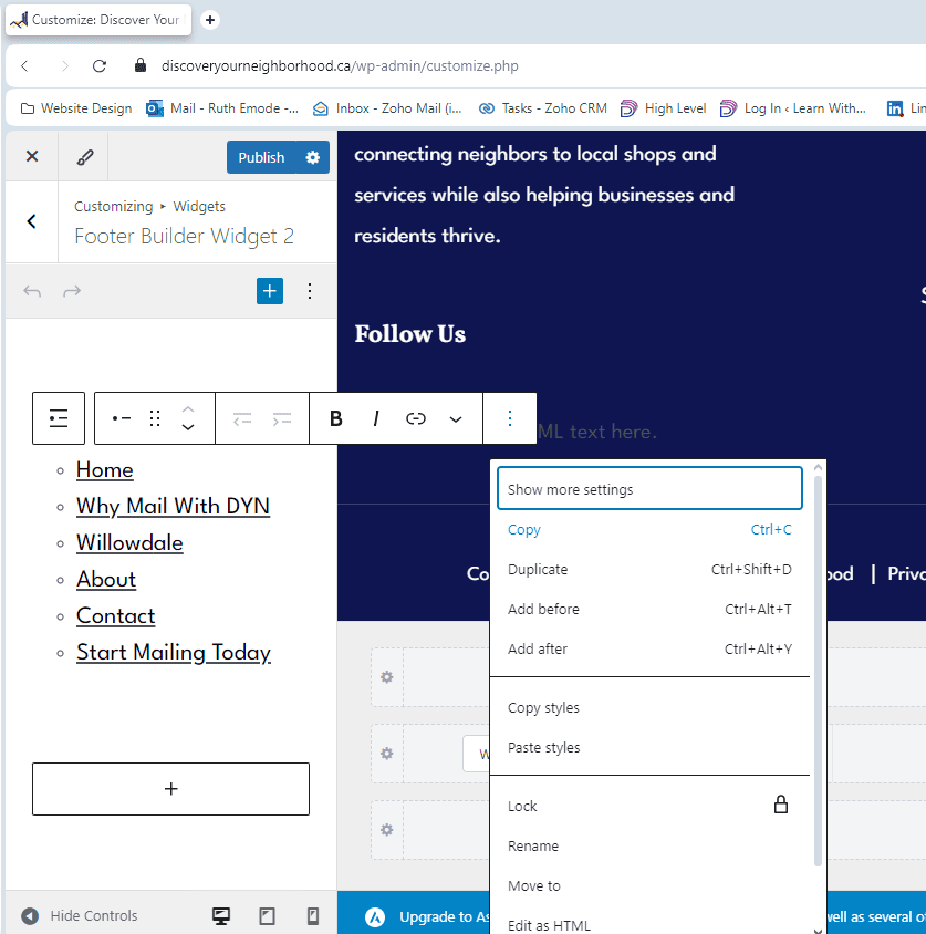
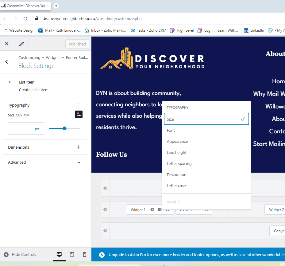
Show More Settings can have settings for styling the typography, and if you click on the three vertical dots, you’ll see all the typography options, like Size, Font, Appearance (like bold or semi-bold), Letter Spacing, etc.
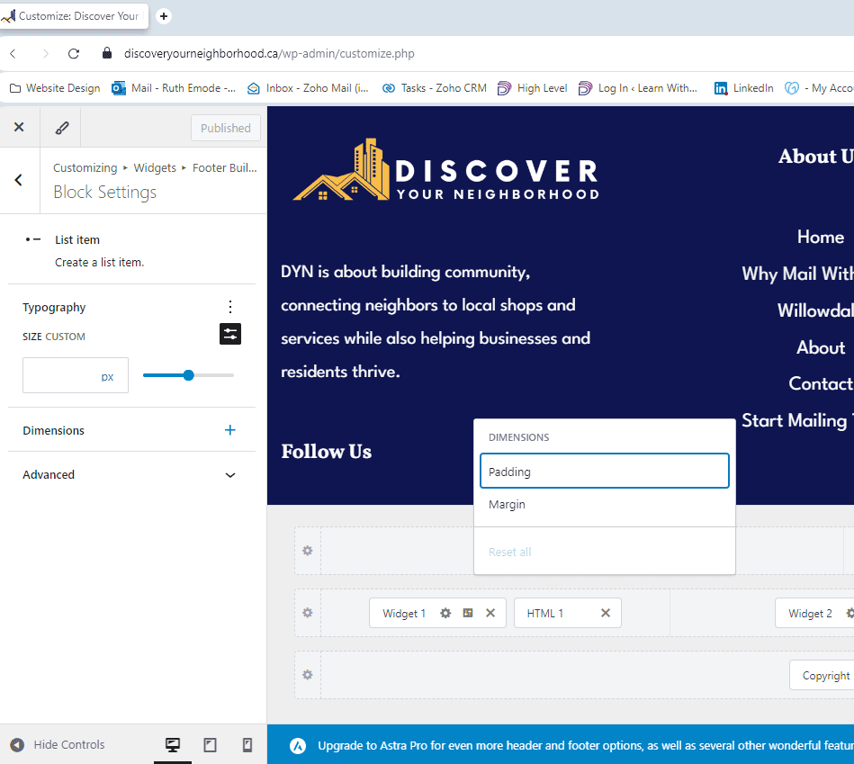
If you click on the + next to Dimensions, you’ll see options for adding spacing via padding and margin.
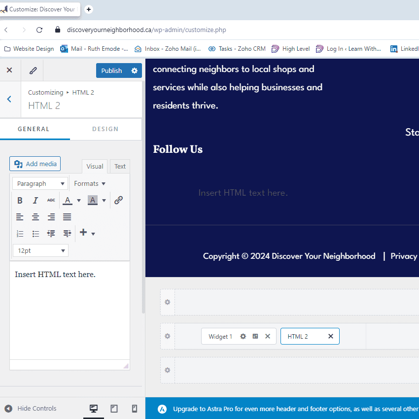
Lastly, for HTML sections, there are two panels, General for adding content and Design for styling.
Adding content in HTML sections is fairly simple, like using Microsoft Word, but they have less customization options than the widgets so it might be better to use widgets to control things like spacing and such.
Ultimate Addons for Elementor
IMPORTANT: If you can’t edit the footer or a section above the footer, then the Astra template you installed probably comes with this additional plugin, which is used to add global sections like footers or pre-footers with the page builder Elementor instead of the block editor.
You can find it by going to the WordPress Dashboard and clicking on UAE > Header & Footer Builder, and there you’ll see the pre-made sections that you can edit the same way you edit pages with Elementor.
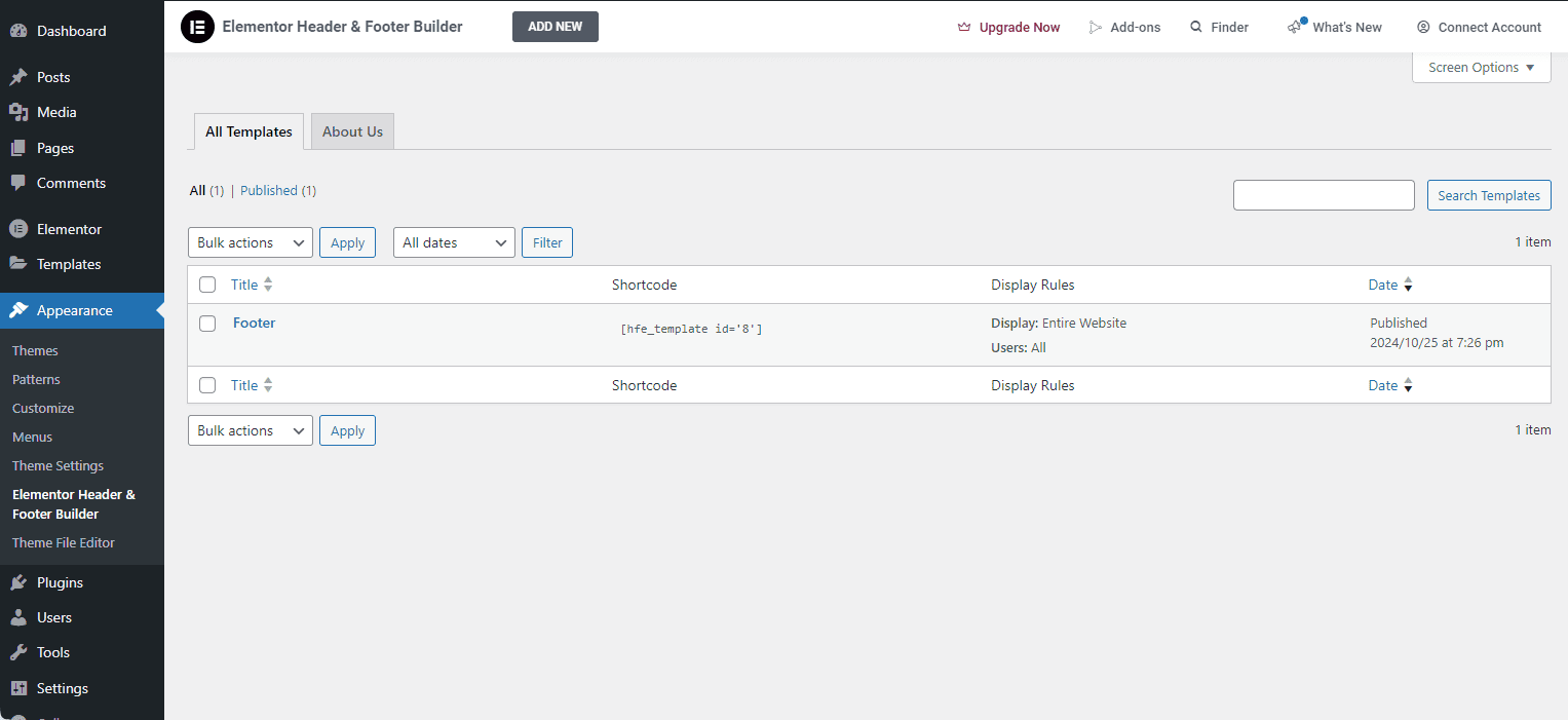
Technically, Elementor Header & Footer Builder is an unnecessary plugin because you could just use Astra’s footer widgets.
If you’re able to (re)create your footer in Astra, I strongly suggest you do because as you’ll learn in the Best Practices module, the fewer plugins the better.